

California DMV Redesign
Year
2019
Team
Esther Jan
Duration
4 weeks
Role
UI/UX Designer
The Department of Motor Vehicles (DMV) is a state-level office that administers vehicle registration, vehicle ownership, and driver's license. The process of making an appointment to the office is often found tedious because users will have to go through numerous pages of websites, and filling out lengthy forms.
This is a 4-week individual assignment from the "Product Design Studio" course at UC Berkeley, I redesigned the online appointment process to create a seamless experience that can easily guide users to completion.
Process

Discover
To better understand the problem, I analyzed the existing screens of the appointment system to see what are the elements that are causing confusion to users.


Key Goals
Simplify User Flow
The current user flow of making an online reservation on the California DMV website takes users through a total of ten screens to reach completion. Moreover, throughout the flow, many of the pages are text-based with a couple of requirements hiding within the texts.
Eliminate Repeating Screens
One of the biggest frustrations is that the user won't be able to know which time slot is available, they would be brought through pages of recursions until they have selected the correct time.
My key decision is to reduce the steps the user has to go through and to bring the time selection page forward, so the user won't be fatigued by the number of screens he/she has to go through.
"How might we improve the online reservation experience for users on mobile,
to efficiently reduce the on-site waiting line?"
Problems
A lot of information is thrown right at the user, overwhelming them with the confusion of what is important, and what is not.
1. Visual Noise
2. Redundancy
Some sentences and additional information appears repeatedly, this results in taking up unnecessary spaces on the mobile screen and could cause confusion.
3. Confusion of the flow
Users may be discouraged to go through the online appointment system when they are unavailable to locate which step they are currently at and how many steps are in total to reach completion.

Wireframe
I started off to create wireframe sketches for the new design. Among the whole user flow, I picked two specific screens that I think are crucial to improving the whole experience.


Service Menu:
Navigation
Before the user starts the online appointment system, he/she has to go through a page to select the service they need.
The existing page is hard to navigate due to the lack of descriptions. For users who are unfamiliar with the DMV services, they will have to click through each button to get a hint of which service they should be choosing.
Research


Office Selection:
Interaction
After the user is in the middle of making an appointment, they will be asked to select the office they wish to visit.
The existing "Map Selection" and "Office Selection" screen display is too static, making it dull and unresponsive to the device the user is using.
Iteration
Throughout 4 weeks, I continuously interviewed my classmates as potential users. And according to their feedback, I iterated the design. Also, I adjusted the style of the screens by changing the primary color to a brighter blue and eliminated the grey backdrop to give the whole mobile website a more modern atmosphere.
Service Menu:
Office Selection:

Wireframe

1st Hi-Fi Mockup

Wireframe

1st Hi-Fi Mockup
Adjusted User Flow
The initial user flow of the online appointment system requires users to go through a total of 10 steps. I restructured the order of "Date Selection" and "Office Selection" to simplify the flow.
I added the function for users to switch between "select by date or location" after they entered the Appointment System. This can allow them to find the right date/time/office more efficiently. If one selection method doesn't work, they can simply switch between tabs rather than being brought through multiple webpages.

Final Design
Emphasis on
affordance and text hierarchy
Due to the lack of text hierarchy and affordance design, users will have difficulty in distinguishing a "word" to a "button".
I redesigned the "Online Service" page into a dashboard, with large buttons and icons to allow users to better understand all the services provided at DMV in a glance.


Magnified the buttons to make it easier for users to tap on mobile screens.
"Map Selection"
as an auxiliary function
During iteration, I spent a lot of time deciding how to design a map selection function that is not only simple to navigate, but also the design can fit the color palette of the website.
After observing other existing websites (ex. Apple Support Page), I realized that my main goal throughout the user flow should be making it efficient for users to choose the office they desired to visit.
As a result, I decided to move the "Map Selection" as an option that is provided just for specific users with such needs.

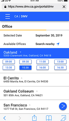
When the user select a time slot, the system will automatically suggest available offices, this design allows the user to decide which office they want to visit without going through the map.
Color and Icons
Throughout the existing user flow, the primary color of the California DMV has changed 3 times, which may confuse the user to whether they have jumped to another website.
I picked a brighter blue to give the website a more modern look and kept the original yellow also as one of the main colors.

Adding "tap confirm"
function
The original buttons are very small and mostly in the form of text, it may be difficult for users to click on the items they want.
Therefore, except for enlarging the button and adding a related icon to each button, I also added the tap confirm function. When the user clicks on the item they want, the button will first change to blue and when they click again, the webpage will then enter the next screen.
This design can prevent the user from pressing the wrong button, also serves as a secondary confirmation function.

After four weeks of working on improving the online appointment system of the California DMV mobile webpage, we were asked to submit a Hi-Fi prototype as our final result.
"Artifacts communicate your design ideas well and error states are included. Overall the design achieves the goal by the visual approach and iconography, which adds friendliness to the flow."
----- Feedback from the class instructor
Reflection
Prioritize the problems first.
When designing a product, it's easy to become over-invested in creating a solution that answers all the problems. However, through this project, I realized that I have to prioritize the problems that I wanted to solve in order to achieve the best result over the course of four weeks. As a result, I segmented the four weeks into four sections where I focused on listening to user feedback, optimizing the user flow, making wireframes and collecting feedback, then final prototype.
Focus on the user and all else will follow.
As my first UX "redesign" project, I learned through the process of how essential users' feedback is. Since this is a class project when everyone is working individually on the same problem at the same time, I had the chance to listen to ideas/insights/design solutions from my classmates, and treat every discussion as a "user interview session" to improve my work.

_JPG.jpg)